I’ve been working on my personal website, and I found myself wanting to display the myriad of programming languages/pieces of software I’ve got vague knowledge of, while pretending I’m further than ‘inurl:stackoverflow’-level. Of course, everyone knows that’s exactly what those ‘skill charts’ are for.
The layout
I wholeheartedly agree with this StackOverflow question’s over-arching theme: skill-charts based on percentages make absolutely no sense. What on earth is Python: 80% supposed to mean? You know 80% of Python’s docs? Are we talking 2 or 3? Can you apply what you remember from those docs? Why are we here?
![[[worried laughter intensifies]] Wh-what? I have so many questions.](/assets/img/skills-percentages-iq-4000.png)
Of course, it’s much better to create a labeled chart, that uses highly specific terms like ‘beginner’, ‘intermediate’ and ‘advanced’ to accurately convey your skill level. So I set about creating just that.
Note: I realise that’s actually a terrible idea, but I only realised that after going through a few hours of ChartJS headaches. In the age-old tradition of my blogposts, I’m writing about this just in case ‘someone else might find this useful’.
So without further ado, let’s talk about how to make ChartJS charts with labels on both axes!
The documentation and first attempts
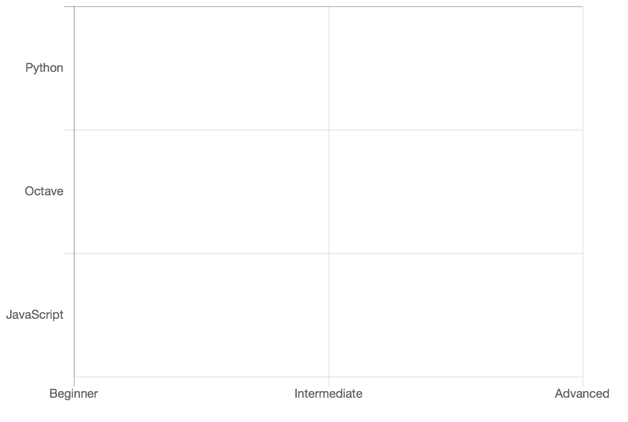
Of course, the first stop is the documentation. I had settled on a horizontal bar chart, with on the y-axis the different programming languages, and on the x-axis the skill-level. Thankfully, the documentation states ChartJS offers support for exactly that! And I quote:
Using both
xLabelsandyLabelstogether can create a chart that uses strings for both the X and Y axes.
Fan-friggin-tastic! Let’s get to it then! I’ve omitted some code for brevity.
var codingChartData = {
    yLabels: ["Python", "Octave/MATLAB", "JavaScript"],
    xLabels: ["Beginner", "Intermediate", "Advanced"],
Andddd, nothing happens.
Hmm, maybe I have to add type: 'category' to the xAxes option.
Ah, there we go, the labels appear. Wait, where did my data go?
This is the part where I spent a solid few hours debugging, trying to guess the way the chart expected its data to be fed to it (many permutations of nested lists and arrays were tried), to get my damn skill levels to validate my lacking confidence in the software area. It didn’t help that the documentation doesn’t talk about so-called ‘categorical charts’ at all, with the exception of the quote I posted above. To no avail, I went to sleep frustrated.
The ‘solution’
The next morning, I remembered reading about some type of callback function that formatted those labels I was hunting in a StackOverflow answer. I figured I could use that to convert the numerical data into strings for the labels. I got rid of my xLabels that had proven useless so far, and replaced the type option with the callbacks:
ticks: {
        callback: function(value) {
          if (value === 1)
            return 'Beginner';
          else if (value === 2)
            return 'Intermediate';
          else if (value === 3)
            return 'Advanced';
          else
            return '';
        }
That seemed to actually work! However, I didn’t have any skills that reached the ‘Advanced’ level (I’m not that cocky), which caused ChartJS to promptly nuke that label, and expand the graph to have ‘Intermediate’ as a maximum. Additionally, the chart started at ‘Low’ instead of zero, which didn’t give me the chance to highlight that I had actually heard of the language in question one time. To solve this, I added a max: 3 parameter, and set the tick’s option beginAtZero: true.
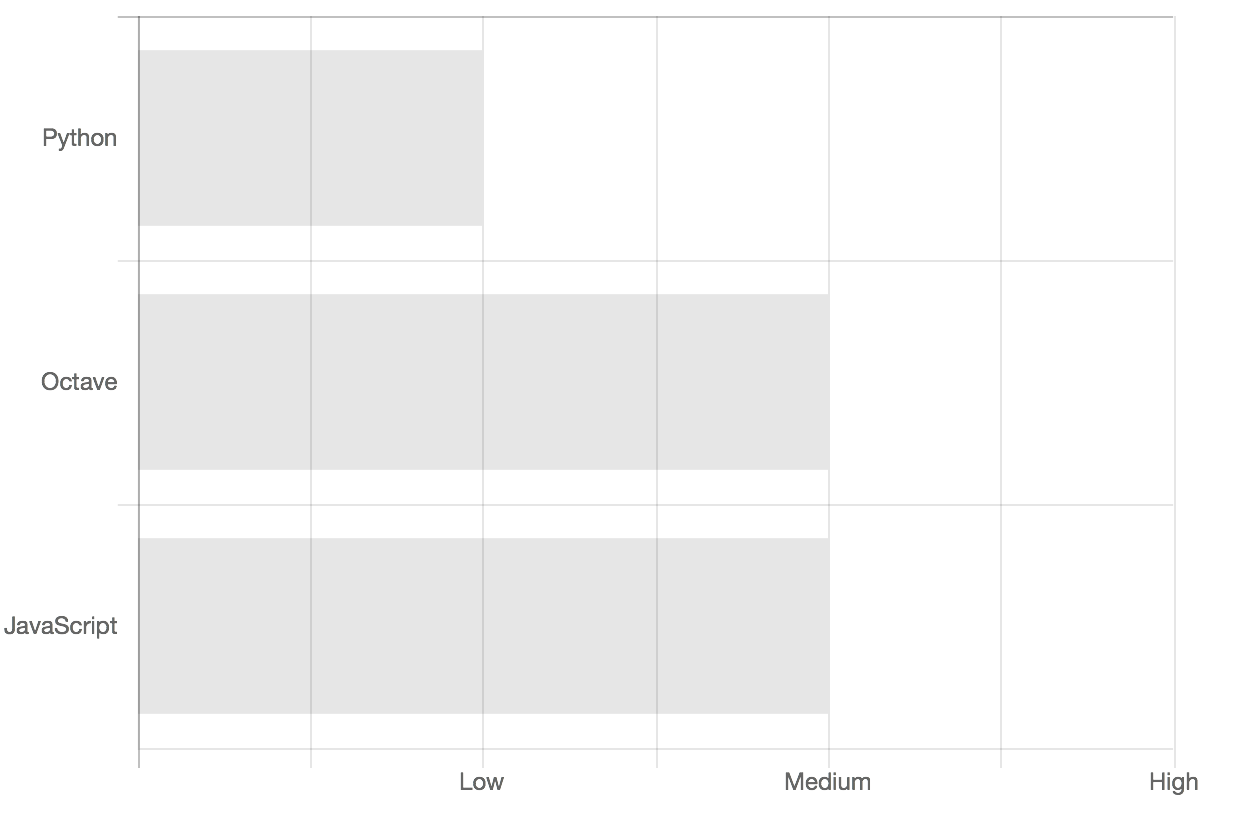
I removed the horizontal gridlines as well, but was left with the ugly grey ticks on the y-axis which offended me greatly. Thankfully, ChartJS has an option for that! So I just set drawTicks: false and expected that’d fix my triggered perfectionism.
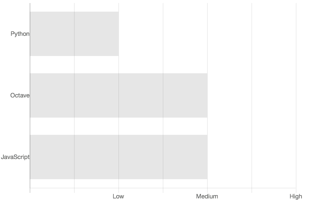
Instead, ChartJS promptly decided to slam my y-axis labels into the actual axis itself. At this point I had grown so tired of ChartJS and its… relatively curt documentation, that after briefly Googling ‘ChartJS labels padding’ and not finding anything, I just decided to pad it using spaces:
labels: ["Python ", "Octave/MATLAB ", "JavaScript "],
I’m not even capable of feeling the slightest remorse at this tomfoolery on my part: 10 seconds after I saw the chart in its ‘finished’ state, I decided it was all a very silly idea to put something like that on a personal website, and promptly threw the code away. Maybe someone else will find this useful.
I’ve included a full gist of the code here.